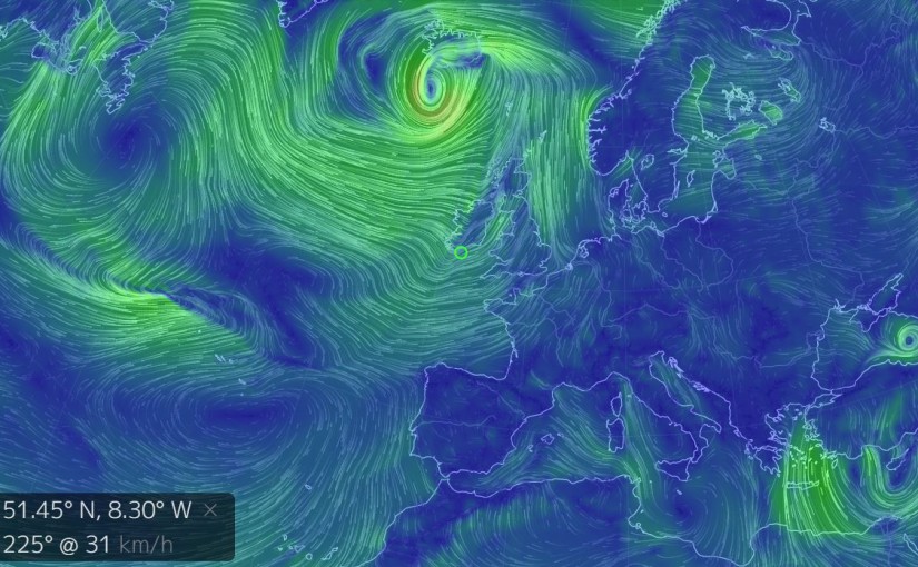
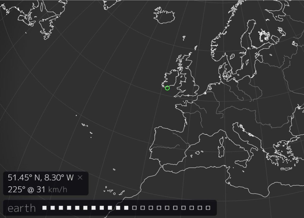
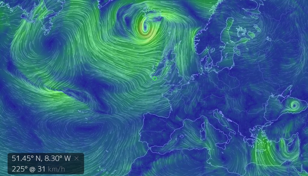
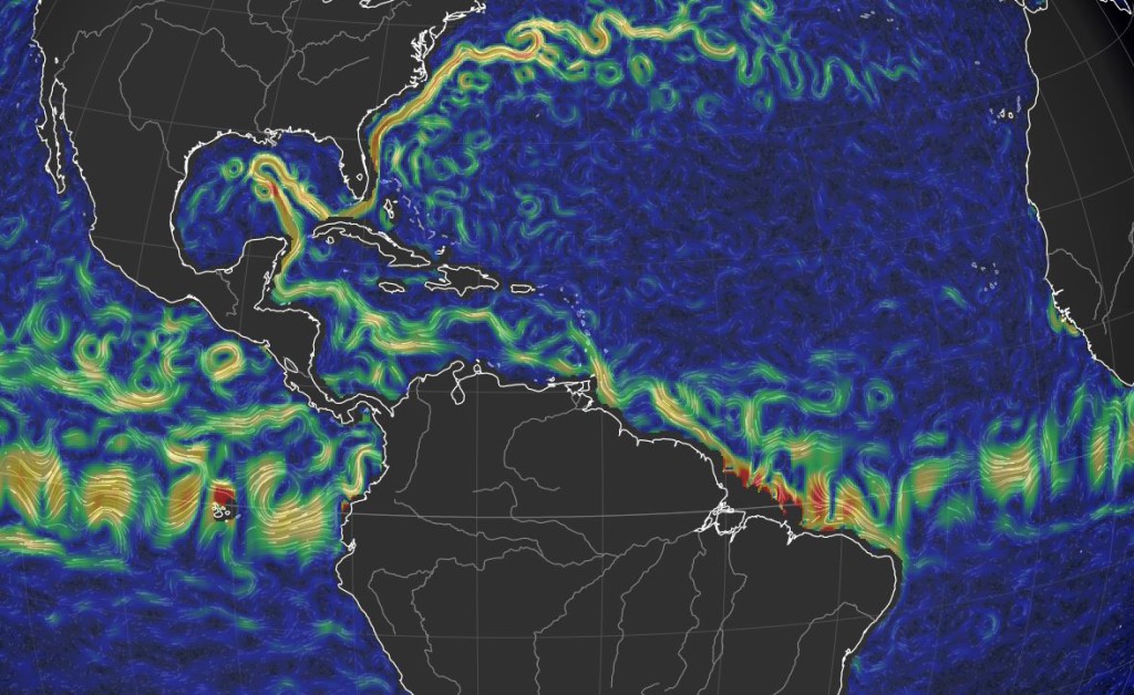
I discovered this crazy – in an awesome way – website that is a pure gem regarding the potential of knowledge acquisition thanks to data visualization. Playful with a lot of options, though intuitive. The rendering of the all the currents and air streams on the exposed part of the globe is fast but for better UX a powerful computer is recommended.
Few screenshots of the website I made to illustrate this post:
3 quick ways to ‘hack’ the website and the information it provides:
- extend the library of human-traceable data: A lot of things could be added to this map basically like fligth/car/ship/internet traffic, animals’ (incl. humans’) migrations, cellphones, pollutions (all kinds), air quality, sea/water/… quality, temperatures, rain levels
- Deploy it at a city scale to acquire data and take measure to improve infrastructures, traffic, …
- mash them on to find if correlations can be found or if simulation models can be improved… – economists and politics would be interested.
Plenty of possibilities made available through a not so known tech called SVG become more popular with the adoption of the HTML5 standard.
Creator is on twitter: https://twitter.com/cambecc